/Xperiome
rebrand
About
Xperiome was established as the parent company for Raremark, aiming to replicate Raremark's success in the rare disease community across various sectors. The goal was to extend Raremark's impact while maintaining a cohesive brand identity.
The problem
Given that the Xperiome site and Raremark were interconnected, there was a possibility that Raremark users might navigate to the Xperiome site. It was crucial to extend the patient-friendly brand that Raremark had meticulously developed
The goals
Sympathetic Branding:
Develop a brand for Xperiome that aligns with the patient-centric ethos of Raremark.
Ensure the new brand resonates with Raremark's audience while maintaining its distinct identity.
Industry Recognition:
Create an identity for Xperiome that stands out in the industry.
Establish a strong, recognizable brand presence that complements Raremark's reputation.
The process
Brand Research:
We conducted extensive research to understand Xperiomes brand values, visual identity, and user perceptions.
We analyzed industry trends and competitor branding to identify opportunities for differentiation.
Stakeholder Interviews:
Engaged with key stakeholders, including Raremark users, healthcare professionals, and internal team members, to gather insights on brand expectations.
Collected feedback on initial brand concepts and iterated based on input.
Visual Identity:
Developed a visual identity for Xperiome that mirrored Raremark's patient-friendly approach while incorporating unique elements to distinguish Xperiome.
Created a cohesive color palette, typography, and iconography that aligned with Raremark’s brand aesthetics.
Brand Messaging:
Crafted clear and consistent brand messaging that communicated Xperiome’s mission and values.
Highlighted Xperiome’s role as an extension of Raremark, emphasizing continuity and trust.
Visual identity
The brand name Xperiome is a portmanteau of experience (referring to the experiences and information submitted by our users) and ome (Complete or collective set of; entirety of. i.e. Biome; proteome; metabolome.) The iconography in the logo was created to reference this using speech bubbles collected together to represent the user’s collective experiences.
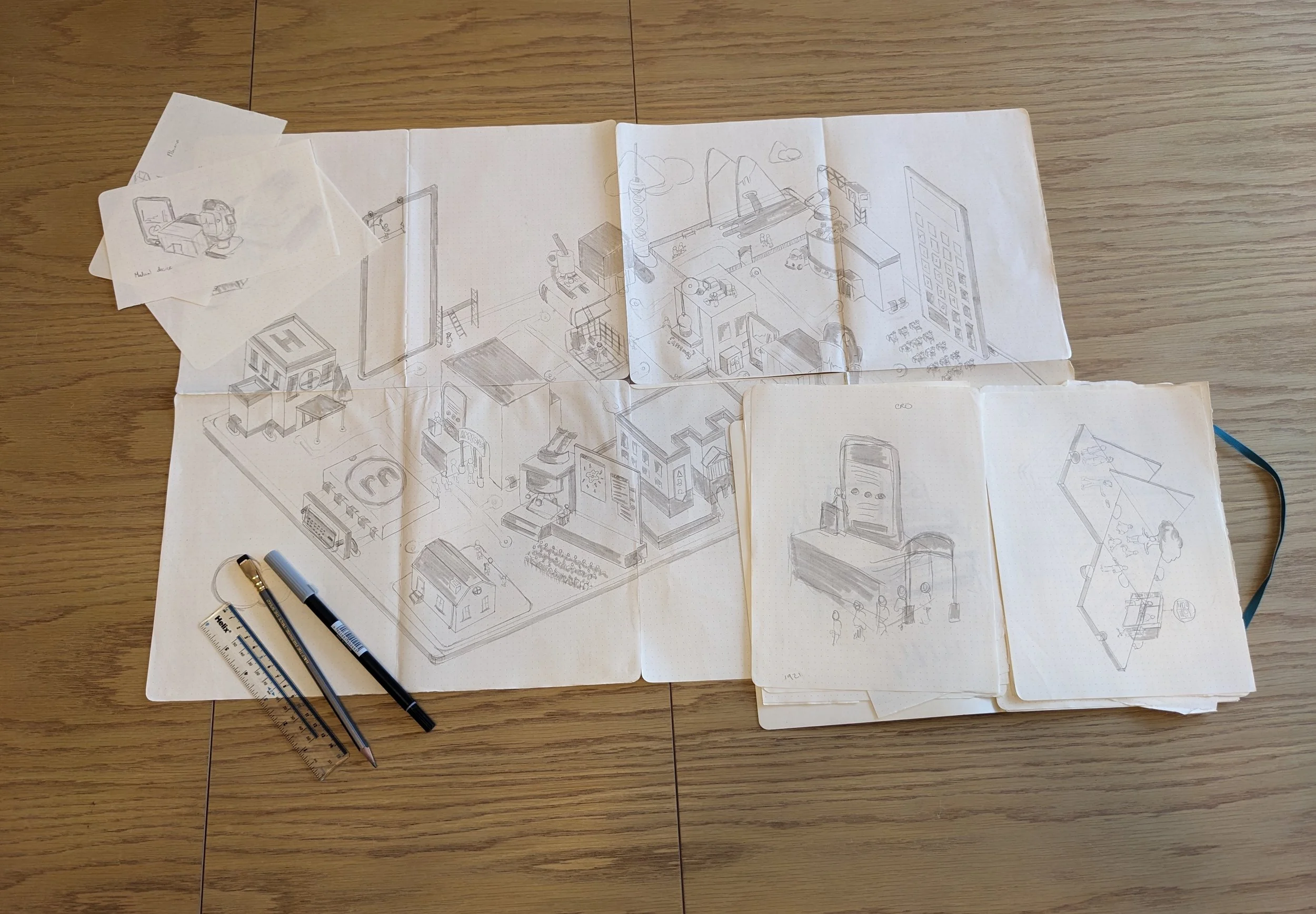
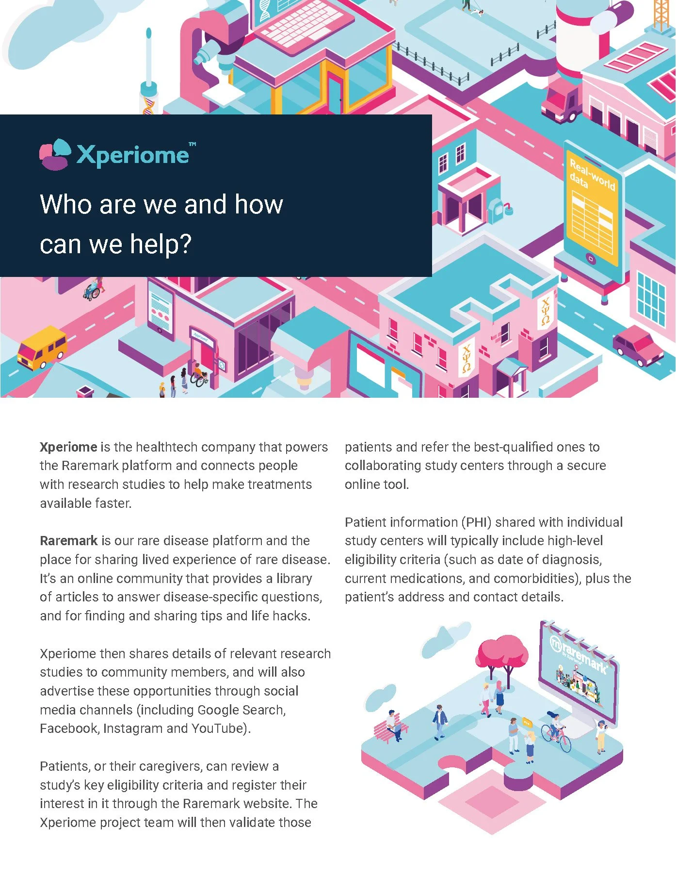
The concept behind the illustration was to display the clinical research side of health tech as an ecosystem constructed of many parts. The services offered were often bespoke and therefore cherry picked from a list depending on the client’s requirements so the visual of jigsaw pieces was utilised.
The theme of scenes being set on jigsaw pieces was also used to also show the relation between everyday patient life and how it connects with research.
Xperiome was also conceived as being the home of industry-facing research. Originally all the data on Raremark was to be feedback to the patient community so it needed to be as accessible as possible. For Xperiome we needed to create a space for the same information to be fed back to industry in a more scientific format.
It was also here that we were able to feed back progress on clinical trials and studies and use these as a showcase as well as providing any findings/resolutions on completed studies.
Outcome
The brand development project successfully established Xperiome as a distinct yet complementary entity to Raremark. The new brand identity was well-received by stakeholders, effectively conveying the patient-centric values of Raremark while positioning Xperiome as a leader in its sector. User feedback indicated a positive reception to the seamless brand experience and the clarity of the brand messaging.


